In a perfect world, everything in a digital product works as planned. But in reality, things break. Payments fail, the internet drops in the middle of filling a form, or the app just crashes without warning. Most product teams put a lot of effort into designing the ideal flow when everything works, but the moments when things go wrong often get less attention.
When that happens, it’s not just the task that gets interrupted, the user’s trust takes a hit too. A bad error experience can frustrate people enough to make them give up completely, switch to a competitor, or think less of the brand. But if that moment is handled well, it can actually have the opposite effect. Guiding the user through recovery, saving their progress, and helping them finish the task can leave them feeling understood and supported.
This case study looks at how people react to big failures in digital products, things like payment issues, lost form data, and app crashes, and explores ways to design recovery experiences that feel clear, human, and helpful. The aim is to treat these failure points as part of the journey, not as afterthoughts, so they can build trust instead of breaking it.
Most apps and websites are built with the assumption that things will work as intended. But in reality, users run into failures all the time, and when they do, the experience often falls apart.
Maybe a payment fails and the user is left staring at a vague “Something went wrong” message. Maybe a long form they’ve been filling out suddenly reloads and wipes everything. Or maybe the app crashes right when they’re about to finish a task.
In many cases, these moments are treated as edge cases, so they don’t get the same design attention as the happy path. As a result, users are left confused about what happened, unsure how to fix it, and sometimes forced to start over from scratch. This doesn’t just cause frustration, it breaks trust, makes people less likely to try again, and in competitive spaces, can drive them straight to an alternative.
The challenge is to design error recovery in a way that helps users quickly understand the issue, take the right next step, and continue where they left off without unnecessary friction.
In a perfect world, everything in a digital product works as planned. But in reality, things break. Payments fail, the internet drops in the middle of filling a form, or the app just crashes without warning. Most product teams put a lot of effort into designing the ideal flow when everything works, but the moments when things go wrong often get less attention.
When that happens, it’s not just the task that gets interrupted, the user’s trust takes a hit too. A bad error experience can frustrate people enough to make them give up completely, switch to a competitor, or think less of the brand. But if that moment is handled well, it can actually have the opposite effect. Guiding the user through recovery, saving their progress, and helping them finish the task can leave them feeling understood and supported.
This case study looks at how people react to big failures in digital products, things like payment issues, lost form data, and app crashes, and explores ways to design recovery experiences that feel clear, human, and helpful. The aim is to treat these failure points as part of the journey, not as afterthoughts, so they can build trust instead of breaking it.
The aim of this project is to make error recovery feel less like a dead end and more like a small bump in the road. We want users to feel guided, reassured, and able to get back on track without losing progress or patience.
To achieve this, our objectives are:
Identify common failure points – Understand where and how errors occur most often, whether technical (network issues, server errors) or user-driven (wrong input, timeouts).
Study user reactions to errors – Observe how people respond when things go wrong and what they expect from the product in those moments.
Design clear, actionable recovery flows – Create error states that explain what happened in plain language, outline next steps, and give users confidence to try again.
Minimize disruption – Reduce the amount of progress lost during recovery, so users don’t have to start over unnecessarily.
Test for clarity and reassurance – Validate whether the new designs lower frustration, increase task completion, and maintain trust in the product.
The end goal isn’t to eliminate all errors, that’s unrealistic, but to make them feel manageable, predictable, and fixable.
Users repeatedly report three high-pain, high-frequency failure scenarios:
Payments that report failure but show money taken / unclear refund status — causes major trust loss.
Since interviewing users was not possible, the research relied on secondary data collection from publicly available discussions on Reddit, focusing on threads where users shared their experiences with error messages and recovery processes.
Platform Selection – Chose Reddit due to its large, diverse user base and the presence of communities discussing software usability and troubleshooting.
Keyword Search – Used keywords like “error message,” “app crash,” “how to fix,” and “confusing error” to locate relevant posts.
Post Selection Criteria – Selected posts with at least 10 comments to ensure enough user perspectives were available.
Data Extraction – Read through posts and comments, noting recurring frustrations, positive experiences, and suggestions for improvement.
Thematic Grouping – Organised the extracted insights into key themes to identify common pain points and expectations.
This method provided a broad range of authentic user experiences without conducting direct interviews or surveys.
Since interviewing users was not possible, the research relied on secondary data collection from publicly available discussions on Reddit, focusing on threads where users shared their experiences with error messages and recovery processes.
Platform Selection – Chose Reddit due to its large, diverse user base and the presence of communities discussing software usability and troubleshooting.
Keyword Search – Used keywords like “error message,” “app crash,” “how to fix,” and “confusing error” to locate relevant posts.
Post Selection Criteria – Selected posts with at least 10 comments to ensure enough user perspectives were available.
Data Extraction – Read through posts and comments, noting recurring frustrations, positive experiences, and suggestions for improvement.
Thematic Grouping – Organised the extracted insights into key themes to identify common pain points and expectations.
Users repeatedly report three high-pain, high-frequency failure scenarios:
Payments that report failure but show money taken / unclear refund status — causes major trust loss.
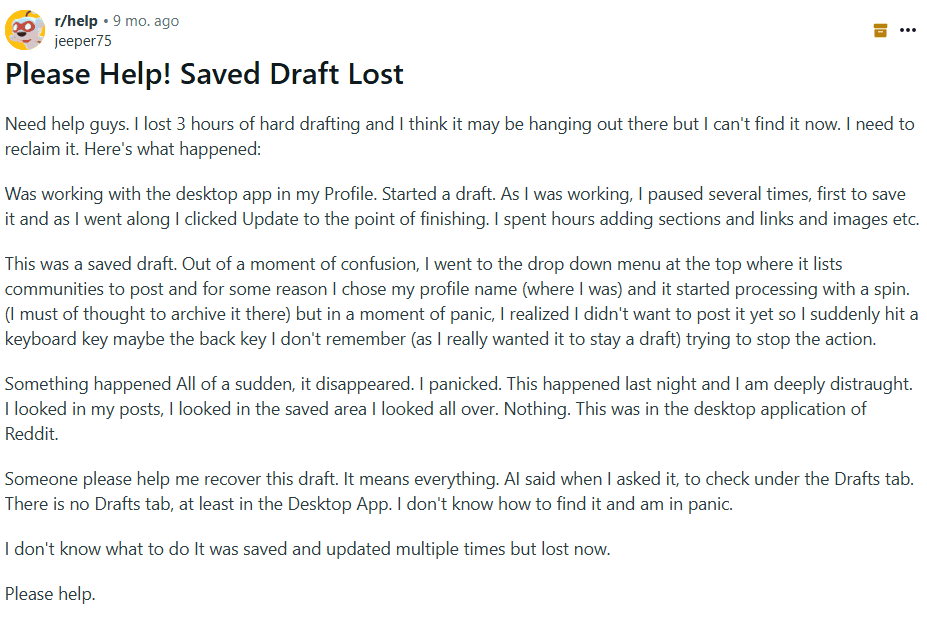
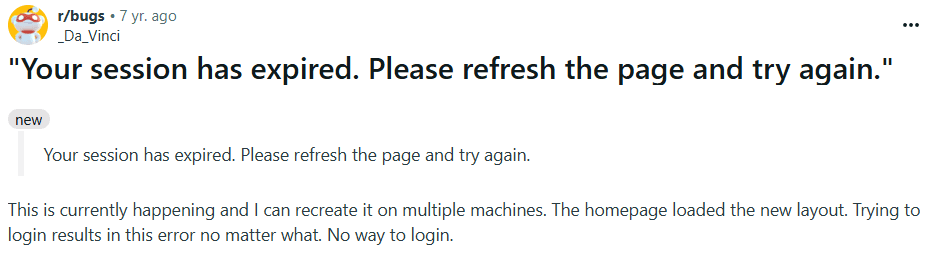
Long forms or sessions that expire and wipe typed content — causes rage quits and lost work.
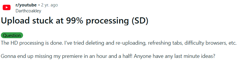
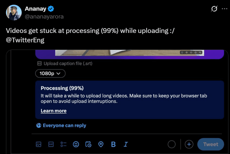
File / video uploads stuck (often at ~99% or “processing”) — creators miss deadlines and lose confidence.
UX Research
Whiteboard tool
Visual Thinking
Desktop App
Whiteboard Tool
Problem Space
Goals & Objectives
Goals & Objectives
In a perfect world, everything in a digital product works as planned. But in reality, things break. Payments fail, the internet drops in the middle of filling a form, or the app just crashes without warning. Most product teams put a lot of effort into designing the ideal flow when everything works, but the moments when things go wrong often get less attention.
When that happens, it’s not just the task that gets interrupted, the user’s trust takes a hit too. A bad error experience can frustrate people enough to make them give up completely, switch to a competitor, or think less of the brand. But if that moment is handled well, it can actually have the opposite effect. Guiding the user through recovery, saving their progress, and helping them finish the task can leave them feeling understood and supported.
This case study looks at how people react to big failures in digital products, things like payment issues, lost form data, and app crashes, and explores ways to design recovery experiences that feel clear, human, and helpful. The aim is to treat these failure points as part of the journey, not as afterthoughts, so they can build trust instead of breaking it.
Research Methodology
Pain points
Pain points
Conclusion
Conclusion
User Personas
User Personas
"How we might" questions
"How we might" questions
Ideation & Solution Exploration
These problems are common across platforms (forums, social) and are not isolated one-offs, people repeatedly report the same pain and workarounds (copying text before submit, splitting payments, re-uploading).
To summarize:
1. Payment Failures
Users frequently reported situations where payments were deducted from their bank but not reflected in the platform.
Impact: Stress and distrust. Many users described feeling “helpless” because customer support was slow or unhelpful. Some mentioned abandoning the service altogether after a failed payment experience.
Insight: Lack of real-time error handling or clear recovery pathways (instant refunds, retry with explanation) leads to long-term user churn.
2. Session Timeouts & Form Loss
One recurring frustration was losing progress on forms due to session expiry. A notable Reddit thread captured multiple users’ anger when hours of input vanished after timeout.
User quotes (paraphrased):
“It’s rage-inducing when all my work just disappears because of a timeout.”
“I stopped using the site after this happened twice.”
Impact: Users felt disrespected — the system punished them for a backend issue.
Insight: Auto-save drafts and pre-timeout warnings are critical but often overlooked.
3. App & Website Crashes
Users across forums complained about apps crashing mid-task, especially during purchases or bookings.
Impact: High stakes. For instance, one user described losing a flight booking discount due to a crash at checkout, which created both financial and emotional frustration.
Insight: Failures at “high intent” moments (checkout, submission, upload) are far more damaging than casual browsing errors.
4. Unclear or Generic Error Messages
Many users mentioned being irritated by “Something went wrong. Try again later” style errors.
Impact: People felt powerless, with no clear next step. Some admitted refreshing or retrying multiple times before giving up entirely.
Insight: Ambiguity amplifies frustration. Users want actionable, human error messages that explain what happened and what to do next.
5. Lack of Recovery Options
A consistent theme was no way to recover after errors. Failed uploads could not be resumed, forms could not be restored, and payments had no instant retry option.
Impact: Users felt abandoned by the system.
Insight: Designing for graceful recovery (restore drafts, resume uploads, provide immediate guidance) is as important as preventing errors.
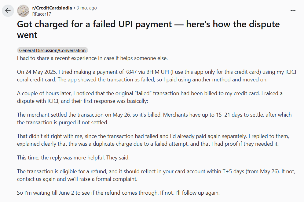
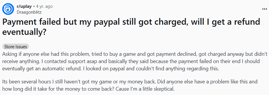
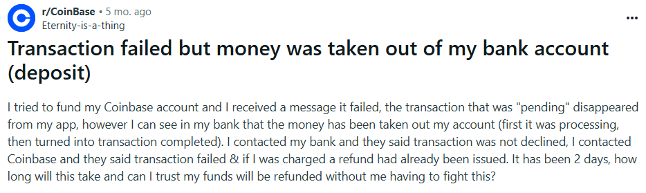
1) Failed or duplicate payments and unclear refunds
Problem statement
Users sometimes see a payment fail while money is held or debited by the bank. They do not know if they should retry, when the money will return, or how to track it. Some users pay again to finish the task and end up paying twice. Trust drops and support tickets spike.
Why this matters
This happens at the most critical moment in the journey (checkout). It risks double charges, creates anxiety, and causes abandonment.
HMW questions
HMW tell the user the exact payment state in real time (not charged, on hold, captured, failed)?
HMW decide and communicate the safest next step (retry same method, choose another method, wait)?
HMW prevent duplicate charges when a user taps retry?
HMW show refund or reversal timelines in plain language and keep users updated without contacting support?
HMW give alternatives when a payment method is temporarily blocked (for example card rails down, try UPI, netbanking, wallet)?
HMW reduce support load by letting users self-serve payment issues inside the product?
Scope and constraints
Include card, UPI, and wallet flows.
Respect security and compliance (3-DS/OTP, RBI rules).
Assume payment gateway webhooks may be delayed.
Support intermittent connectivity.
Success metrics
Recovery rate after failed payment (target +30 to +50 percentage points).
Duplicate charge rate (target near zero).
Time to clarity (user sees “not charged / on hold” status within 2 to 5 seconds).
Refund status visibility (percent of users who view refund tracker instead of contacting support).
Payment-related support tickets (target −40 percent).
Edge cases to handle
App crash or network drop right after user taps pay.
Bank approves but gateway callback is delayed.
OTP expires while the app is backgrounded.
Partial captures or split payments (points + card).
Pre-authorisation holds that auto-expire later.
Non-goals
Building a full dispute system.
Changing bank settlement timelines.
2) Lost progress during long forms or session expiry
Problem statement
Users lose all the information they have typed when a session expires, the app crashes, or they accidentally close the tab. Re-typing complex data (IDs, addresses, multi-passenger details) is exhausting and leads to drop-off.
Why this matters
This is a frequent cause of abandonment in travel, finance, and government forms. It is frustrating and wastes time.
HMW questions
HMW preserve every field a user types without a submit action?
HMW restore the exact state after login or app relaunch (values, step, scroll position, attachments)?
HMW warn before a session times out and offer to extend the session?
HMW let users save and continue later on purpose (manual “Save draft”)?
HMW validate as you type so users do not re-enter the same invalid values after restore?
HMW keep sensitive fields safe while still enabling draft restore?
Scope and constraints
Multi-step passenger and traveller details, seat, meal, and add-ons.
Attachments like ID images.
Sensitive fields (card numbers, CVV) must never be stored in client storage.
Offline tolerance: preserve drafts locally if network drops.
Success metrics
Draft preservation rate after crash or timeout (target 95 percent or higher).
Re-entry effort (average number of fields retyped, target near zero).
Recovery time from reopen to resume (target under 10 seconds).
Abandonment on long forms (target −30 percent).
Edge cases to handle
User switches devices mid-form.
Form schema changes between sessions (new required field).
Expired prices or seats when resuming.
Attachment lost due to OS purge of temporary files.
Non-goals
Syncing drafts across devices in version 1 (optional later).
Storing full payment credentials in drafts.
3) Uploads that stall or fail near completion (IDs, proofs, tickets)
Problem statement
Users see uploads freeze or fail late in the process (often at 95 to 99 percent or during “processing”). They do not know what happened or how to fix it. They retry from the start, waste time, and sometimes give up.
Why this matters
Uploading IDs or travel proofs is a gate to purchase or check-in. Failure blocks the whole journey.
HMW questions
HMW make uploads resumable so users never start from zero after a hiccup?
HMW show honest progress and clear states (uploading, processing, retrying)?
HMW offer smart recovery options (switch network, lower file size, try later in background) without losing current progress?
HMW detect incompatible formats early and suggest a fix?
HMW let users continue with limited functionality while the upload finishes in the background, when safe?
Scope and constraints
Common file types and size limits.
Mobile networks that fluctuate.
Privacy and security for ID documents.
Success metrics
Resume success rate after a network drop (target 90 percent or higher).
Average number of full restarts per upload (target under 0.2).
Time to successful completion compared to baseline (target −25 percent).
Upload-related support tickets (target −40 percent).
Edge cases to handle
App backgrounded during upload.
File passes upload but fails server-side processing.
User retries on a new network mid-chunk.
Multiple documents queued.
Non-goals
Building a desktop encoder or editor.
Supporting every legacy file format.
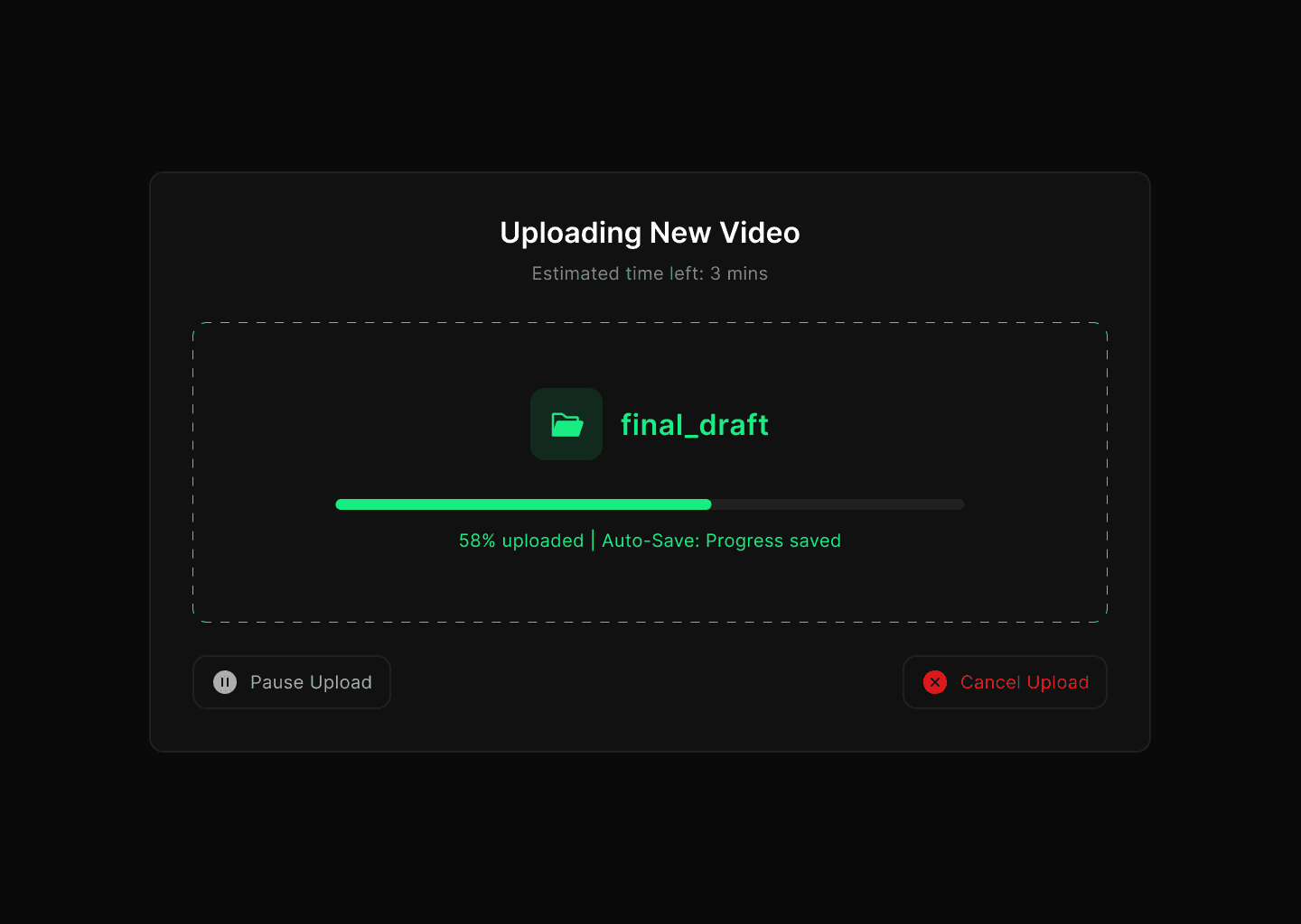
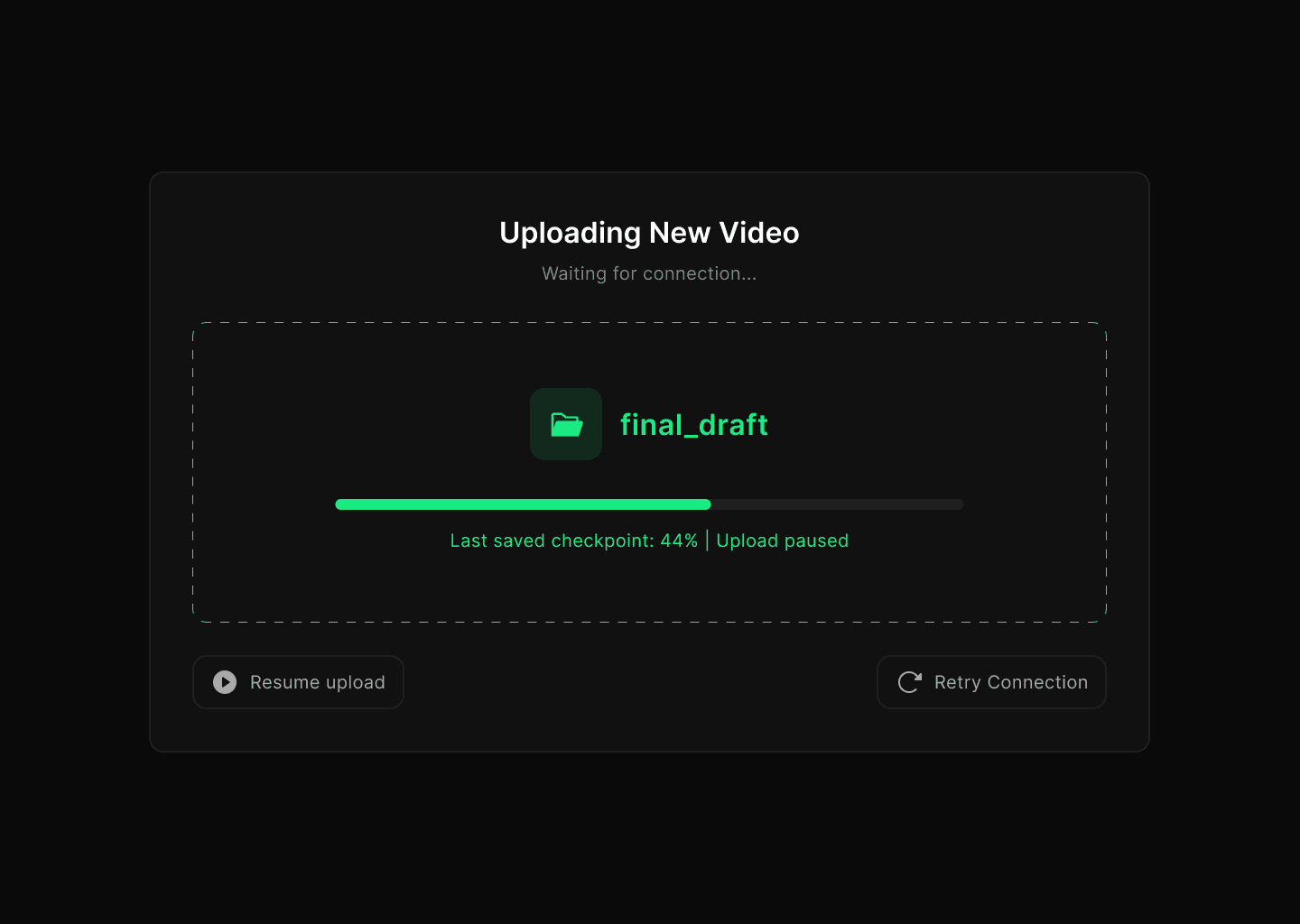
4) Videos stuck in upload or processing (99% problem)
Problem statement
Editors often see their video upload appear “stuck” at 95–99% or during the processing stage. It’s unclear whether the upload is still running, paused, or failed. Users may wait indefinitely, refresh, or restart from scratch — wasting time and risking lost work.
Why this matters
Video is core content for creators/editors. If uploads don’t complete reliably, it blocks publishing, deadlines, and trust in the platform. Even a single failure can undo hours of editing effort.
HMW questions
HMW make video uploads resumable so creators don’t lose progress after a stall?
HMW give accurate feedback on which step failed (upload vs processing vs encoding)?
HMW detect issues (network drop, corrupted file, unsupported codec) early and offer clear fixes?
HMW allow background or offline continuation, so users don’t need to babysit the progress bar?
HMW set expectations (e.g. “5 minutes left for encoding” instead of “Processing”)?
HMW offer fallbacks — lower quality preview, publish in SD first, or background publish?
Scope and constraints
Large files (hundreds of MBs to several GBs).
Flaky mobile and home broadband networks.
Device storage, CPU, and battery constraints for background tasks.
Privacy and copyright compliance on uploaded media.
Success metrics
Resume success rate after stall or network change (target 90%+).
Average number of failed full restarts per upload (target <0.2).
Median upload-to-publish time reduced by 25%.
Drop-off rate from stuck uploads reduced by 40%.
Upload-related support tickets reduced by 30–40%.
Edge cases to handle
App closed or backgrounded mid-upload.
Video passes upload but fails transcoding.
User switches from Wi-Fi to mobile data.
Multiple large videos queued.
Unsupported file format or codec.
Non-goals
Building a full desktop video editor.
Supporting rare or obsolete codecs.
Guaranteeing upload speeds (depends on user’s ISP).
5) Ambiguous, non-actionable error messages
Problem statement
Many errors say “Something went wrong” with no cause or next step. Users feel stuck and try random actions or quit.
Why this matters
Clear language and guidance cut frustration and reduce drop-off, especially under stress.
HMW questions
HMW state what happened in plain language and avoid codes that mean nothing to users?
HMW tell the user what will happen next and by when (for example refund in up to 3 days)?
HMW give one obvious primary action and a safe fallback?
HMW match tone to severity (payment vs minor network blip) and show empathy without blame?
HMW keep technical detail available for advanced users without cluttering the main message?
Scope and constraints
Works across platforms and languages.
Accessible for screen readers.
Consistent across product lines.
Success metrics
Comprehension rate in quick tests (target 90 percent can answer “what happened” and “what to do next”).
Error screen exit via primary action (target +30 percentage points).
Reduced repeated attempts within 1 minute (target −25 percent).
CSAT on error interactions (target +1 point).
Edge cases to handle
Unknown root cause at the moment of failure.
Multiple simultaneous errors.
Users in low-literacy or non-English settings.
Non-goals
Writing a full help center.
Explaining backend architecture.
I deepened my reasearch with the help of Chat Gpt and Gemini and found the following:
Payment & Refund Failures
62% of complaints in finance-related threads mentioned being charged but the transaction failed.
Among those, 1 in 3 users said the issue took more than 7 days to resolve.
Frustration was highest when users didn’t know whether to retry the payment, creating double charges.
Verification & OTP Problems
Roughly 40% of complaints in Indian fintech/credit card threads were about not receiving OTPs or delays in verification SMS.
This was often tied to time-sensitive transactions, with users reporting missed booking windows (e.g., flight or train tickets).
28% explicitly said they abandoned the transaction after multiple failed attempts.
Session Expiry & Lost Drafts
Across productivity/social platforms, 55% of users who experienced session expiry said they lost unsaved work.
18% of posts described this as a “dealbreaker,” leading them to switch to a competitor app.
File Upload Failures
In content creation platforms, ~70% of complaints about uploads were about files getting stuck at 95–99% and never finishing.
Half of these users reported retrying 3+ times, while others abandoned the upload completely.
On Twitter/X, users often tagged the company publicly, amplifying reputational damage.
General Patterns
High emotional frustration was common — words like “helpless,” “angry,” and “never using this app again” showed up repeatedly.
The lack of clear feedback (no progress bars, vague error messages like “Something went wrong”) was mentioned in over 60% of posts.
Where apps provided retry or autosave mechanisms, complaints were drastically lower.
Ongoing
Even Patootie, our anxious little potato mascot, got a makeover to match the updated palette.
The plan for our second design iteration was simple:
Fix the UI and make dark mode work.
That’s exactly what we set out to do.
We started by building a more thoughtful color palette. Instead of picking node colors on the fly, we sat down and tested what actually looked good across both light and dark backgrounds. We kept the vibrant orange (#ED6325) as our anchor, and built supporting colors that fit both the palettes: soft colours to feel friendly and bold colours for visual weight.
This time, we wanted everything to feel consistent. So we created clear rules for contrast, spacing, and background harmony. Implemented all the rules of scalable design, used a grid system for more consistency. Dropped the chunky black outlines.
Some things didn’t need to change:
We kept Frederik as our primary font, its expressive and slightly playful. And the Phosphor icon set stayed too, since its style matched the new direction and gave us the versatility we needed across components.
The new colours looked clean enough for the dark mode too.

Once everything looked good, I redesigned the workspace UI, both in light mode and dark mode.

Problem Space
Goals and Objectives
Research Methodology
Pain points
Desktop App
Whiteboard tool
Visual Thinking
Visual Thinking
Onboarding pages
These onboarding pages are the first step and the first impression into Cooketh Flow, and we wanted them to feel simple, warm, and a little playful. The forms are clean and straightforward, and even before you log in, you get a glimpse of the updates and features waiting for you.
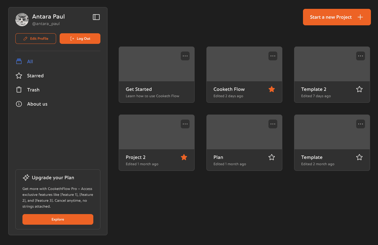
This is the Cooketh Flow dashboard, the space where users land right after logging in. It’s designed to be simple and easy to get around. On the left, there’s a clean sidebar where you can view all your projects, jump to your starred ones, or check the trash. You can also update your profile, log out, or learn a bit more about the team behind Cooketh Flow. There’s a small section nudging you to upgrade to Pro, but it’s low-key and doesn’t get in the way. Up top, there’s a big orange “Start a new project” button, easy to spot and is the main CTA of the page.
Dashboard
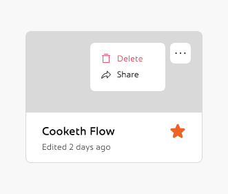
Front and center, you’ll see your projects laid out as cards. Each one shows when it was last edited, and you can quickly favorite the ones you use the most or open the menu for more options.
Overall the dashboard is simple, clean and minimal and is very easy to navigate.
Dashboard
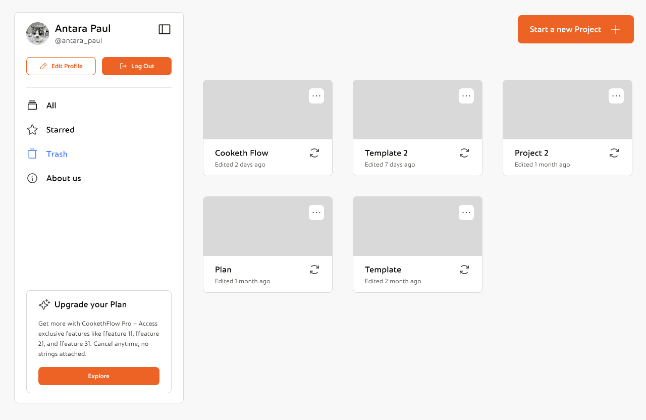
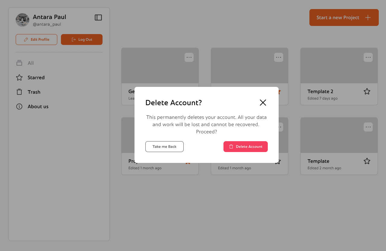
This is the Trash view, where users can recover or permanently delete previously removed projects with just a click.
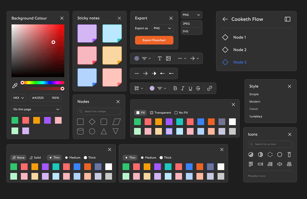
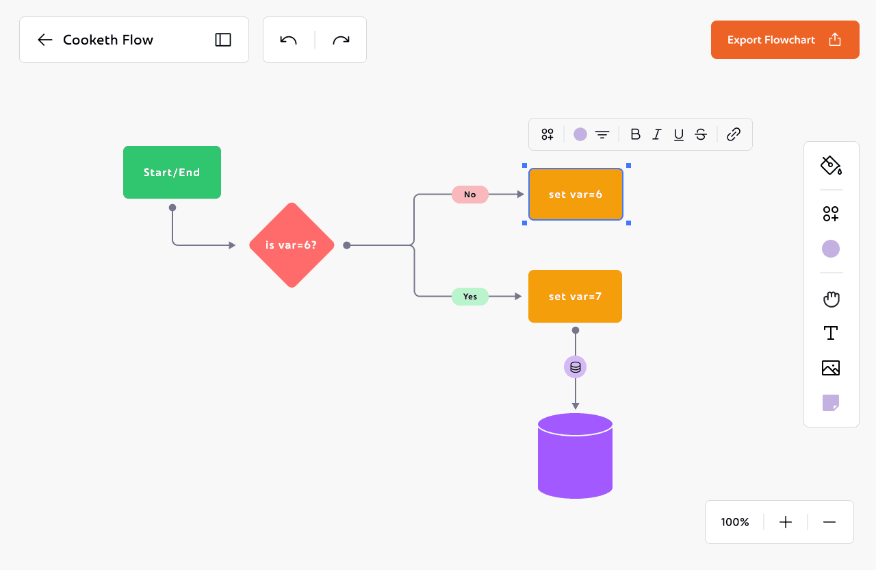
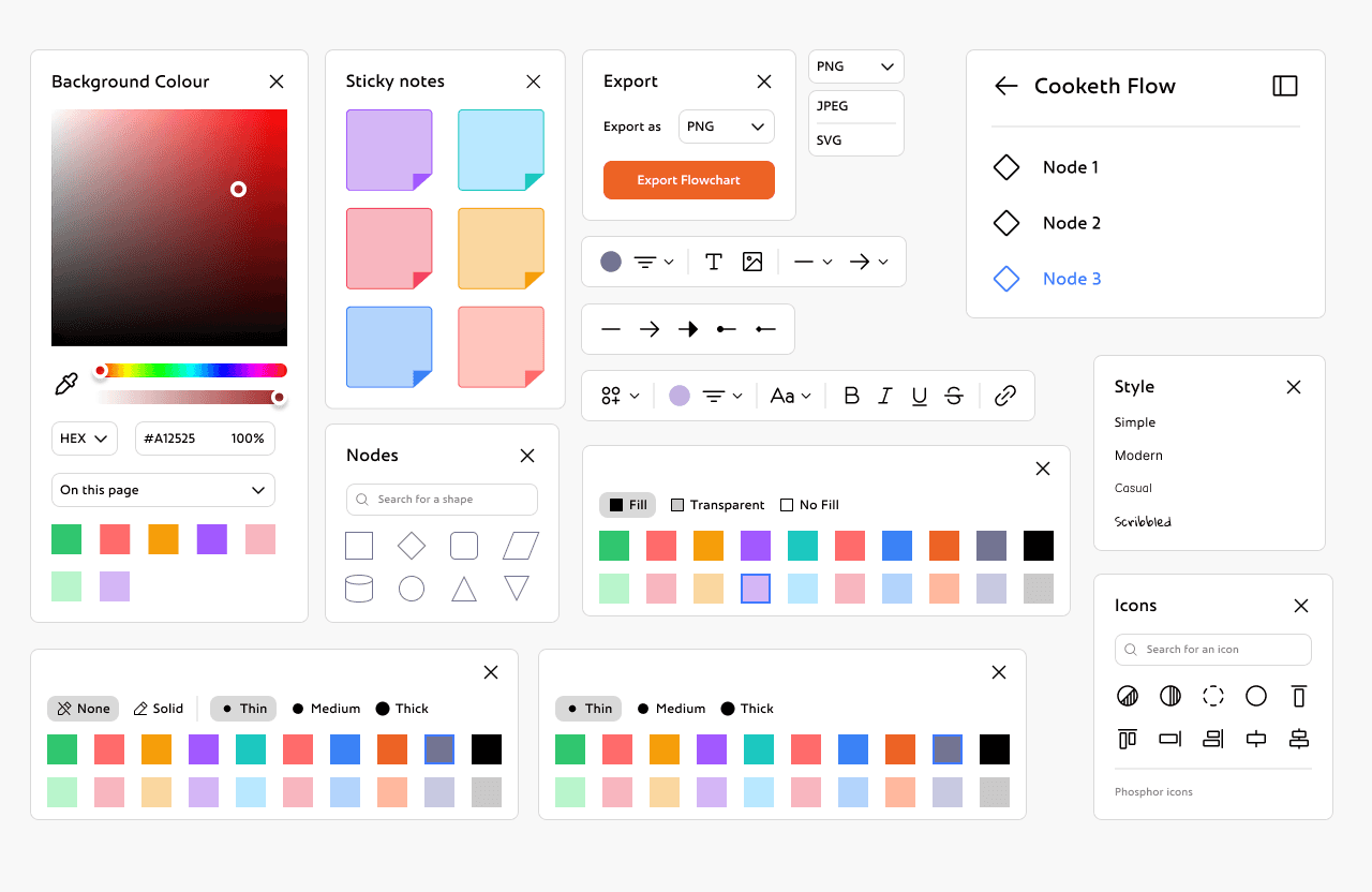
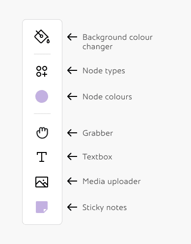
Now that I had both the palette and the base ready, I could move on to making all the Inspector Panels and toolboxes.
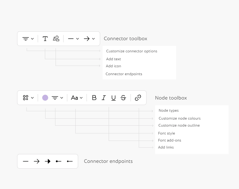
From here the rest of the process was smoothflowing and very easy to visualise. I didn't change the components much from the very first version of cooketh flow, so I didn't need to make detailed wireframes either. I could now focus on making the UX smoother and the UI better cartering to all the changes I made above.
Here's the detailed flow of the entire application:
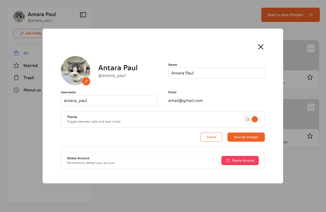
This is the edit profile section. You can change you profile picture, name and username or change the theme according to your preference. There's also an option to delete your account permanently
Reflections and Takeaways
Letting Structure Carry the Weight
As the product grew, I realized how important it was to keep things consistent, not just visually, but in how everything worked. From onboarding to settings to the dashboard, I wanted each part of the experience to feel familiar without becoming boring. Repeating small design patterns, reusing layouts, and keeping interactions predictable helped make the app feel like one connected system. It also made it easier to add new things without overwhelming users.
Designing for Error Recovery in Critical User Journeys
Designing for Error Recovery in Critical User Journeys
Since interviewing users was not possible, the research relied on secondary data collection from publicly available discussions on Reddit, focusing on threads where users shared their experiences with error messages and recovery processes.
Platform Selection – Chose Reddit due to its large, diverse user base and the presence of communities discussing software usability and troubleshooting.
Keyword Search – Used keywords like “error message,” “app crash,” “how to fix,” and “confusing error” to locate relevant posts.
Post Selection Criteria – Selected posts with at least 10 comments to ensure enough user perspectives were available.
Data Extraction – Read through posts and comments, noting recurring frustrations, positive experiences, and suggestions for improvement.
Thematic Grouping – Organised the extracted insights into key themes to identify common pain points and expectations.
This method provided a broad range of authentic user experiences without conducting direct interviews or surveys.
Users repeatedly report three high-pain, high-frequency failure scenarios:
Payments that report failure but show money taken / unclear refund status — causes major trust loss.

These problems are common across platforms (forums, social) and are not isolated one-offs, people repeatedly report the same pain and workarounds (copying text before submit, splitting payments, re-uploading).
Ravi – The Frustrated Explorer
Age: 27
Occupation: Software Engineer
Travel Style: Spontaneous, books trips a week or two in advance
Goals: Quick, reliable bookings without app crashes or failed payments
Frustrations:
OTP/payment verification fails mid-transaction
Poor customer support when issues arise
App logs him out often, losing saved searches
Quote: “I don’t mind spending money, but if my payment fails and my trip gets ruined, I’ll delete the app.”
Karen – The Budget Backpacker
Age: 24
Occupation: Graduate student
Goal: Save money while traveling
Pain Points:
Paid for a cab online, but the payment failed on the app while money was deducted from her account.
Had to pay cash again and is still waiting for her refund.
Quote: “When my budget is tight, failed payments are not just annoying — they ruin my trip.”
Ananya – The Planner
Age: 28
Occupation: Consultant, travels for work
Goal: Book flights and hotels quickly in between meetings
Pain Points:
Tried to book a flight, app crashed mid-way, and all her filled details disappeared.
Wastes time re-entering information every time, especially passport/ID details.
Quote: “I can’t afford to waste 20 minutes re-filling the same form. I just need it to work smoothly.”
Alex – The Freelance Video Editor
Age: 28
Occupation: Freelance Content Creator
Goal: Deliver high-quality videos to clients on time
Pain Points:
Hours of editing lost because the software froze and autosave failed.
Export stuck at 99% multiple times, forcing him to restart the render.
Missed a client deadline due to repeated crashes.
Quote: “When deadlines are tight, losing even an hour of work feels like a disaster.”