Cooketh Flow
Cooketh Flow
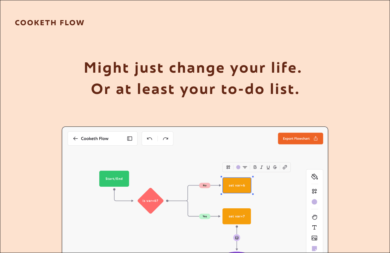
CookethFlow is an open-source visual thinking tool, made for FOSS Hacks 2025. Built as an alternative to tools like Excalidraw, FigJam and draw.io, it helps in mapping your ideas and visualise them.
Project Overview
CookethFlow started as a weekend idea for FOSS Hacks 2025. We wanted to build a collaborative whiteboard tool that had everything visual thinking needs.
Even though we didn’t win, we genuinely loved the idea. It scratched an itch we felt every day while working together: the need for a fast, clean, and open source tool.
So we kept going.
Now, CookethFlow is more than just a hackathon project. It’s our take on what creative collaboration should feel like: open, visual, and delightfully minimal.
We're building it in public and have come a long way.
Problem Space
Creative teams need an entire thinking environment.
But right now, that environment is fragmented.
Designers use FigJam for collaboration and sktches, Excalidraw for flowcharts, draw.io for flowcharts and sketching, Miro for brainstorming, and Notion for writing it all down.
That’s five tabs open before any real work begins.
This constant context-switching breaks focus, kills momentum, and makes creative thinking feel like a chore.
There’s no single space where people can ideate, plan, diagram, and document, without jumping between apps or sacrificing speed.
Branding
The name Cooketh came from a running joke between friends.
Whenever we found ourselves in a chaotic, slightly unhinged situation, we’d just sigh and say, "We are cooketh". It was our way of laughing through the mess.
So when it came time to chose a name for our project, there was no debate.
The name Cooketh came from a running joke between friends.
Whenever we found ourselves in a chaotic, slightly unhinged situation, we’d just sigh and say, "We are cooketh". It was our way of laughing through the mess.
So when it came time to chose a name for our project, there was no debate.
The branding didn’t stop at the name. We wanted something that captured the emotion of creating things in public, the pressure, the absurdity, the joy.
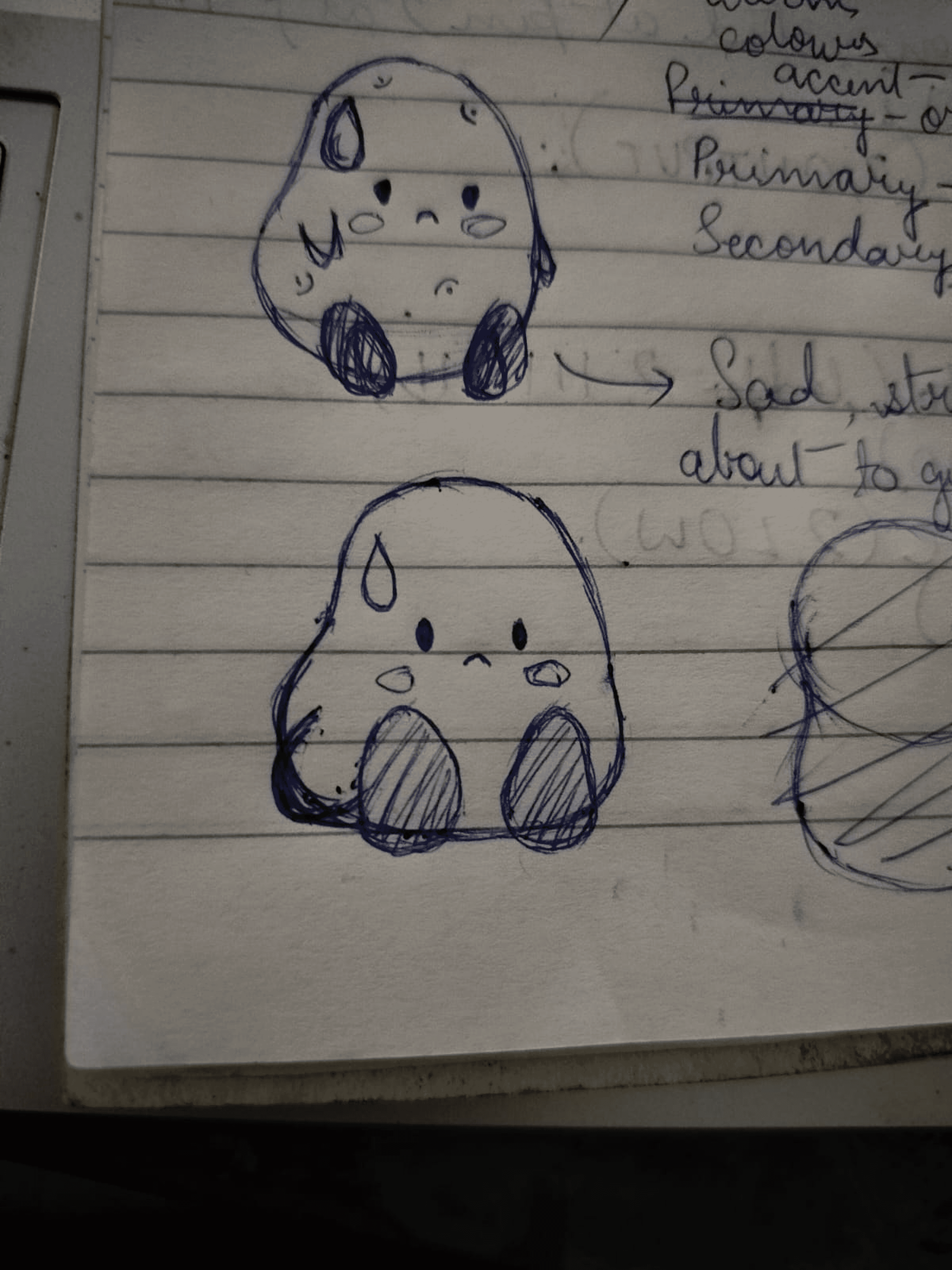
So we chose a tensed potato as our mascot.
Why? Because potatoes are my favorite vegetable. And also because sometimes, under pressure, we all feel like potatoes.
We named her Patootie.Her colors? #E97637 and #EB9943, wrapped in a bold black outline, flowing with the neu brutalism.
The branding didn’t stop at the name. We wanted something that captured the emotion of creating things in public, the pressure, the absurdity, the joy.
So we chose a tensed potato as our mascot.
Why? Because potatoes are my favorite vegetable. And also because sometimes, under pressure, we all feel like potatoes.
We named her Patootie.Her colors? #E97637 and #EB9943, wrapped in a bold black outline, flowing with the neu brutalism.

• Figma
• FigJam
• UX/UI Designer
• UX Researcher
Project Details
First Iteration (Alpha Version)
First Iteration (Alpha Version)
First Iteration (Alpha Version)
Second Iteration (0.1.1)
Second Iteration (0.1.1)
The plan for our second design iteration was simple:
Fix the UI and make dark mode work.
That’s exactly what we set out to do.
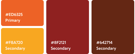
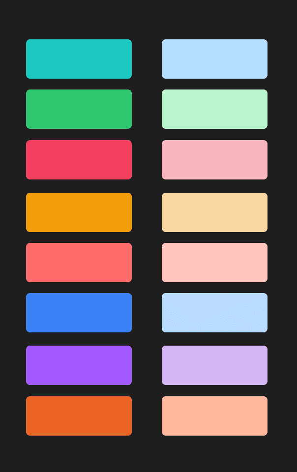
We started by building a more thoughtful color palette. Instead of picking node colors on the fly, we sat down and tested what actually looked good across both light and dark backgrounds. We kept the vibrant orange (#ED6325) as our anchor, and built supporting colors that fit both the palettes: soft colours to feel friendly and bold colours for visual weight.
This time, we wanted everything to feel consistent. So we created clear rules for contrast, spacing, and background harmony. Implemented all the rules of scalable design, used a grid system for more consistency. Dropped the chunky black outlines.
Some things didn’t need to change:
We kept Frederik as our primary font, its expressive and slightly playful. And the Phosphor icon set stayed too, since its style matched the new direction and gave us the versatility we needed across components.
The new colours looked clean enough for the dark mode too.
The plan for our second design iteration was simple:
Fix the UI and make dark mode work.
That’s exactly what we set out to do.
We started by building a more thoughtful color palette. Instead of picking node colors on the fly, we sat down and tested what actually looked good across both light and dark backgrounds. We kept the vibrant orange (#ED6325) as our anchor, and built supporting colors that fit both the palettes: soft colours to feel friendly and bold colours for visual weight.
This time, we wanted everything to feel consistent. So we created clear rules for contrast, spacing, and background harmony. Implemented all the rules of scalable design, used a grid system for more consistency. Dropped the chunky black outlines.
Some things didn’t need to change:
We kept Frederik as our primary font, its expressive and slightly playful. And the Phosphor icon set stayed too, since its style matched the new direction and gave us the versatility we needed across components.
The new colours looked clean enough for the dark mode too.
Flaws
Revisiting the branding
Duration
Ongoing
My Role
• UX/UI Designer
• UX Researcher
• Figma
• FigJam
Tools
The first version of Cooketh Flow was built in true hackathon spirit, fast and messy.
We didn’t have a roadmap and didn't follow a proper design system.
Despite the rush, we wanted a bold and vibrant design, so we went with the neo-brutalist aesthetic. Harsh grids, raw typography, high-contrast colors, we wanted the UI to feel unapologetical and bright. But it wasn’t executed that well. The visuals were clunky, spacing was inconsistent, and accessibility wasn’t even on the radar.
At first the pages were simple:
A few onboarding screens
A simple dashboard
And the first version of the workspace canvas


We selected Frederik as our primary typeface for its distinctive character and readability, which brings both personality and clarity to the interface. For icons, we chose the Phosphor icon set due to its versatility, clean structure, and visual consistency across different components of the application.
To strike a balance between boldness and approachability, we applied a palette of soft pastel colors to the nodes, giving them a visually inviting feel while maintaining clarity and focus within the canvas.
While the design looked pretty solid in light mode, things started to fall apart when we tried building a dark version. The pastel colors clashed hard, and the thick black outlines just didn’t work in darker backgrounds. We tried a bunch of tweaks, but it never quite felt right.
Eventually, we decided to scrap it and go back to the drawing board. We knew we needed a more flexible color system that could hold up across themes, and a UI language that felt more balanced and accessible—without losing the playful vibe we started with.
The new system is still very us, just more refined and way easier to work with—whether you’re team light mode or team dark.
While the design looked somewhat okay in light mode, things started to fall apart when we tried building a dark version. The pastel colors clashed hard, and the thick black outlines just didn’t work in darker backgrounds. We tried a bunch of tweaks, but it never quite felt right. There was no initial wireframing or planning, thus the overall scalability of the application started raising questions.
Eventually, we decided to scrap it and go back to the drawing board. We knew we needed a more flexible color system that could hold up across themes, and a UI language that felt more balanced and accessible, without losing the playful vibe we started with.
The new system is still very us, just more refined and way easier to work with—whether you’re team light mode or team dark.
While the design looked pretty solid in light mode, things started to fall apart when we tried building a dark version. The pastel colors clashed hard, and the thick black outlines just didn’t work in darker backgrounds. We tried a bunch of tweaks, but it never quite felt right.
Eventually, we decided to scrap it and go back to the drawing board. We knew we needed a more flexible color system that could hold up across themes, and a UI language that felt more balanced and accessible, without losing the playful vibe we started with.
The new system is still very us, just more refined and way easier to work with—whether you’re team light mode or team dark.
One of the biggest issues we faced early on was with our primary color, that muted orange (#E97637). While it had personality, it often felt dull against brighter backgrounds, and it didn’t pair well with dark mode either. The black outlines across the UI made things even harsher, and over time, the whole system started to feel boxed in and heavy. Another big issue was even though the orange was the primary colour, it was never used across the website. It was only used for the mascot.
The logo, too, became a pain point. We had gone all in with details, but quickly realized it broke one of the golden rules of identity design: it wasn’t scalable. It looked great large, but completely fell apart at smaller sizes, especially when used as an app icon or favicon.
So we decided to clean things up.
We kept the spirit of the orange (because we still loved it), but switched to a more vibrant and energetic shade, #ED6325 and built a new color palette around it. The harsh black outlines were dropped across the UI in favor of a softer, more flexible visual style that plays well in both light and dark modes.
Even Patootie, our anxious little potato mascot, got a makeover to match the updated palette.
One of the biggest issues we faced early on was with our primary color, that muted orange (#E97637). While it had personality, it often felt dull against brighter backgrounds, and it didn’t pair well with dark mode either. The black outlines across the UI made things even harsher, and over time, the whole system started to feel boxed in and heavy. Another big issue was even though the orange was the primary colour, it was never used across the website. It was only used for the mascot.
The logo, too, became a pain point. We had gone all in with details, but quickly realized it broke one of the golden rules of identity design: it wasn’t scalable. It looked great large, but completely fell apart at smaller sizes, especially when used as an app icon or favicon.
So we decided to clean things up.
We kept the spirit of the orange (because we still loved it), but switched to a more vibrant and energetic shade, #ED6325 and built a new color palette around it. The harsh black outlines were dropped across the UI in favor of a softer, more flexible visual style that plays well in both light and dark modes.
Even Patootie, our anxious little potato mascot, got a makeover to match the updated palette.
Even Patootie, our anxious little potato mascot, got a makeover to match the updated palette.
Project Details
Duration
Ongoing
My Role
Tools
• UX/UI Designer
• UX Researcher
• Figma
• FigJam
Flaws
Revisiting the branding
One of the biggest issues we faced early on was with our primary color, that muted orange (#E97637). While it had personality, it often felt dull against brighter backgrounds, and it didn’t pair well with dark mode either. The black outlines across the UI made things even harsher, and over time, the whole system started to feel boxed in and heavy. Another big issue was even though the orange was the primary colour, it was never used across the website. It was only used for the mascot.
The logo, too, became a pain point. We had gone all in with details, but quickly realized it broke one of the golden rules of identity design: it wasn’t scalable. It looked great large, but completely fell apart at smaller sizes, especially when used as an app icon or favicon.
So we decided to clean things up.
We kept the spirit of the orange (because we still loved it), but switched to a more vibrant and energetic shade, #ED6325 and built a new color palette around it. The harsh black outlines were dropped across the UI in favor of a softer, more flexible visual style that plays well in both light and dark modes.
Even Patootie, our anxious little potato mascot, got a makeover to match the updated palette.
Our new logo captures the playfulness we want to convey and also is a little spoiler for future features we are planning on adding.
The plan for our second design iteration was simple:
Fix the UI and make dark mode work.
That’s exactly what we set out to do.
We started by building a more thoughtful color palette. Instead of picking node colors on the fly, we sat down and tested what actually looked good across both light and dark backgrounds. We kept the vibrant orange (#ED6325) as our anchor, and built supporting colors that fit both the palettes: soft colours to feel friendly and bold colours for visual weight.
This time, we wanted everything to feel consistent. So we created clear rules for contrast, spacing, and background harmony. Implemented all the rules of scalable design, used a grid system for more consistency. Dropped the chunky black outlines.
Some things didn’t need to change:
We kept Frederik as our primary font, its expressive and slightly playful. And the Phosphor icon set stayed too, since its style matched the new direction and gave us the versatility we needed across components.
The new colours looked clean enough for the dark mode too.
Once everything looked good, I redesigned the workspace UI, both in light and in dark mode.
Now that I had both the palette and the base ready, I could move on to making all the Inspector Panels and toolboxes.
From here the rest of the process was smoothflowing and very easy to visualise. I didn't change the components much from the very first version of cooketh flow, so I didn't need to make detailed wireframes either. I could now focus on making the UX smoother and the UI better cartering to all the changes I made above.
Here's the detailed flow of the entire application:
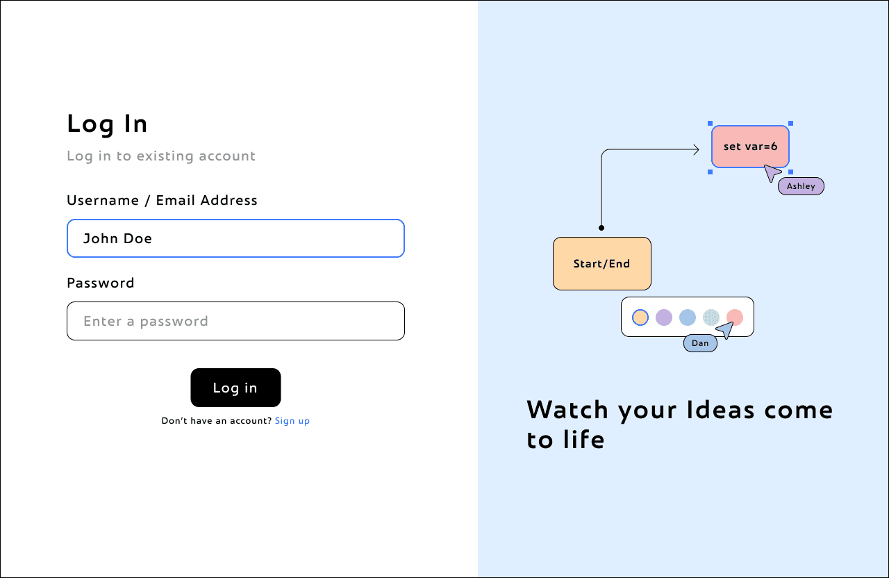
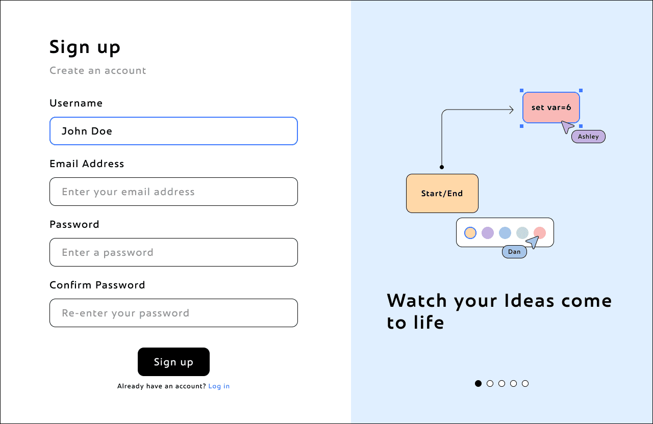
These onboarding pages are the first step and the first impression into Cooketh Flow, and we wanted them to feel simple, warm, and a little playful. The forms are clean and straightforward, and even before you log in, you get a glimpse of the updates and features waiting for you.
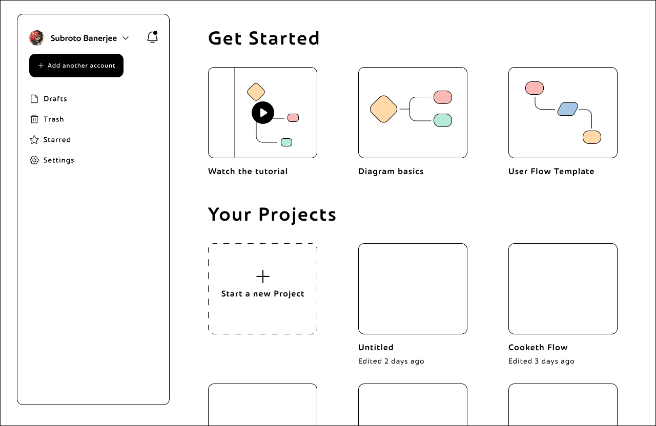
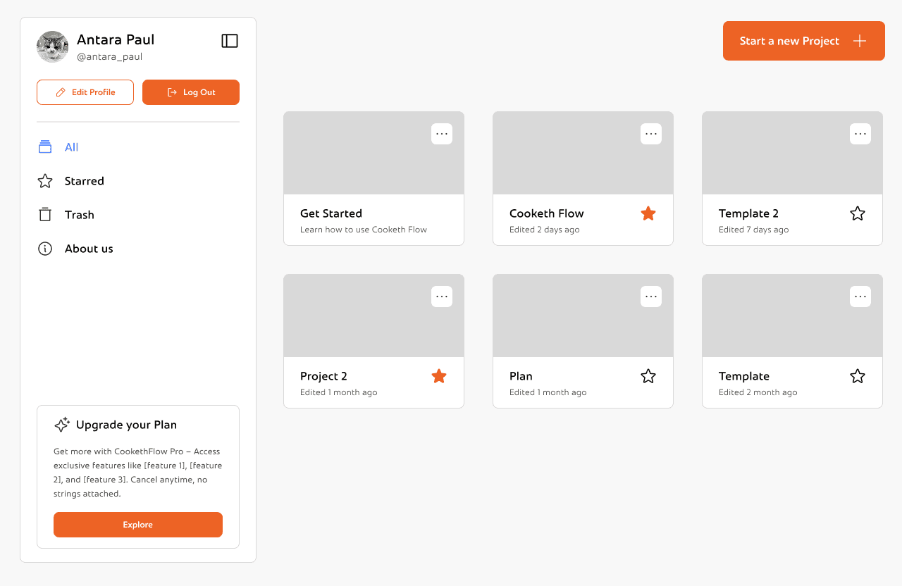
This is the Cooketh Flow dashboard, the space where users land right after logging in. It’s designed to be simple and easy to get around. On the left, there’s a clean sidebar where you can view all your projects, jump to your starred ones, or check the trash. You can also update your profile, log out, or learn a bit more about the team behind Cooketh Flow. There’s a small section nudging you to upgrade to Pro, but it’s low-key and doesn’t get in the way. Up top, there’s a big orange “Start a new project” button, easy to spot and is the main CTA of the page.
Front and center, you’ll see your projects laid out as cards. Each one shows when it was last edited, and you can quickly favorite the ones you use the most or open the menu for more options.
Overall the dashboard is simple, clean and minimal and is very easy to navigate.
CookethFlow is an open-source visual thinking tool, made for FOSS Hacks 2025. Built as an alternative to tools like Excalidraw, FigJam and draw.io, it helps in mapping your ideas and visualise them.
Project Details
Duration
Ongoing
My Role
Tools
One of the biggest issues we faced early on was with our primary color, that muted orange (#E97637). While it had personality, it often felt dull against brighter backgrounds, and it didn’t pair well with dark mode either. The black outlines across the UI made things even harsher, and over time, the whole system started to feel boxed in and heavy. Another big issue was even though the orange was the primary colour, it was never used across the website. It was only used for the mascot.
The logo, too, became a pain point. We had gone all in with details, but quickly realized it broke one of the golden rules of identity design: it wasn’t scalable. It looked great large, but completely fell apart at smaller sizes, especially when used as an app icon or favicon.
So we decided to clean things up.
We kept the spirit of the orange (because we still loved it), but switched to a more vibrant and energetic shade, #ED6325 and built a new color palette around it. The harsh black outlines were dropped across the UI in favor of a softer, more flexible visual style that plays well in both light and dark modes.
Even Patootie, our anxious little potato mascot, got a makeover to match the updated palette.
While the design looked pretty solid in light mode, things started to fall apart when we tried building a dark version. The pastel colors clashed hard, and the thick black outlines just didn’t work in darker backgrounds. We tried a bunch of tweaks, but it never quite felt right.
Eventually, we decided to scrap it and go back to the drawing board. We knew we needed a more flexible color system that could hold up across themes, and a UI language that felt more balanced and accessible, without losing the playful vibe we started with.
The new system is still very us, just more refined and way easier to work with—whether you’re team light mode or team dark.
The plan for our second design iteration was simple:
Fix the UI and make dark mode work.
That’s exactly what we set out to do.
We started by building a more thoughtful color palette. Instead of picking node colors on the fly, we sat down and tested what actually looked good across both light and dark backgrounds. We kept the vibrant orange (#ED6325) as our anchor, and built supporting colors that fit both the palettes: soft colours to feel friendly and bold colours for visual weight.
This time, we wanted everything to feel consistent. So we created clear rules for contrast, spacing, and background harmony. Implemented all the rules of scalable design, used a grid system for more consistency. Dropped the chunky black outlines.
Some things didn’t need to change:
We kept Frederik as our primary font, its expressive and slightly playful. And the Phosphor icon set stayed too, since its style matched the new direction and gave us the versatility we needed across components.
The new colours looked clean enough for the dark mode too.


Once everything looked good, I redesigned the workspace UI, both in light mode and dark mode.
Once everything looked good, I redesigned the workspace UI, both in light mode and dark mode.

Problem Space
Branding
Revisiting the branding
Once everything looked good, I redesigned the workspace UI, both in light mode and dark mode.
Now that I had both the palette and the base ready, I could move on to making all the Inspector Panels and toolboxes.
Now that I had both the palette and the base ready, I could move on to making all the Inspector Panels and toolboxes.
Desktop App
Whiteboard tool
Visual Thinking
Visual Thinking
From here the rest of the process was smoothflowing and very easy to visualise. I didn't change the components much from the very first version of cooketh flow, so I didn't need to make detailed wireframes either. I could now focus on making the UX smoother and the UI better cartering to all the changes I made above.
Here's the detailed flow of the entire application:


Onboarding pages
Onboarding pages
Dashboard
These onboarding pages are the first step and the first impression into Cooketh Flow, and we wanted them to feel simple, warm, and a little playful. The forms are clean and straightforward, and even before you log in, you get a glimpse of the updates and features waiting for you.
Onboarding pages
Onboarding pages
These onboarding pages are the first step and the first impression into Cooketh Flow, and we wanted them to feel simple, warm, and a little playful. The forms are clean and straightforward, and even before you log in, you get a glimpse of the updates and features waiting for you.
These onboarding pages are the first step and the first impression into Cooketh Flow, and we wanted them to feel simple, warm, and a little playful. The forms are clean and straightforward, and even before you log in, you get a glimpse of the updates and features waiting for you.


This is the Cooketh Flow dashboard, the space where users land right after logging in. It’s designed to be simple and easy to get around. On the left, there’s a clean sidebar where you can view all your projects, jump to your starred ones, or check the trash. You can also update your profile, log out, or learn a bit more about the team behind Cooketh Flow. There’s a small section nudging you to upgrade to Pro, but it’s low-key and doesn’t get in the way. Up top, there’s a big orange “Start a new project” button, easy to spot and is the main CTA of the page.
Dashboard
Inspector panels and Toolboxes
Front and center, you’ll see your projects laid out as cards. Each one shows when it was last edited, and you can quickly favorite the ones you use the most or open the menu for more options.
Overall the dashboard is simple, clean and minimal and is very easy to navigate.
This is the Cooketh Flow dashboard, the space where users land right after logging in. It’s designed to be simple and easy to get around. On the left, there’s a clean sidebar where you can view all your projects, jump to your starred ones, or check the trash. You can also update your profile, log out, or learn a bit more about the team behind Cooketh Flow. There’s a small section nudging you to upgrade to Pro, but it’s low-key and doesn’t get in the way. Up top, there’s a big orange “Start a new project” button, easy to spot and is the main CTA of the page.
Dashboard
Front and center, you’ll see your projects laid out as cards. Each one shows when it was last edited, and you can quickly favorite the ones you use the most or open the menu for more options.
Overall the dashboard is simple, clean and minimal and is very easy to navigate.
Dashboard
Inspector panels and Toolboxes
This is the Cooketh Flow dashboard, the space where users land right after logging in. It’s designed to be simple and easy to get around. On the left, there’s a clean sidebar where you can view all your projects, jump to your starred ones, or check the trash. You can also update your profile, log out, or learn a bit more about the team behind Cooketh Flow. There’s a small section nudging you to upgrade to Pro, but it’s low-key and doesn’t get in the way. Up top, there’s a big orange “Start a new project” button, easy to spot and is the main CTA of the page.
Front and center, you’ll see your projects laid out as cards. Each one shows when it was last edited, and you can quickly favorite the ones you use the most or open the menu for more options.
Overall the dashboard is simple, clean and minimal and is very easy to navigate.
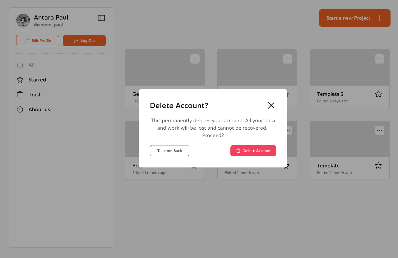
This is the Trash view, where users can recover or permanently delete previously removed projects with just a click.
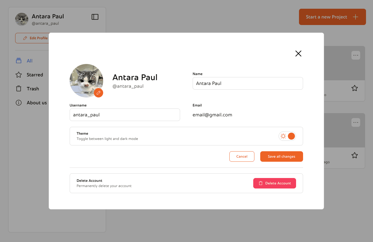
This is the edit profile section. You can change you profile picture, name and username or change the theme according to your preference. There's also an option to delete your account permanently
While working on Cooketh Flow, one of the things I kept coming back to was how to make the product feel fun without making it feel chaotic. I didn’t want it to look too serious or dry but also didn’t want the personality to get in the way of people just trying to get work done. Little choices like adding a warm-toned mascot, using colors that felt soft but confident, and writing microcopy that sounded like a real person helped me find that balance. It taught me that sometimes, design doesn’t need to scream delight; it just needs to feel like it’s on your side.
As the product grew, I realized how important it was to keep things consistent, not just visually, but in how everything worked. From onboarding to settings to the dashboard, I wanted each part of the experience to feel familiar without becoming boring. Repeating small design patterns, reusing layouts, and keeping interactions predictable helped make the app feel like one connected system. It also made it easier to add new things without overwhelming users.
This is the Trash view, where users can recover or permanently delete previously removed projects with just a click.
This is the Trash view, where users can recover or permanently delete previously removed projects with just a click.
This is the edit profile section. You can change you profile picture, name and username or change the theme according to your preference. There's also an option to delete your account permanently


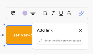
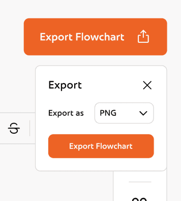
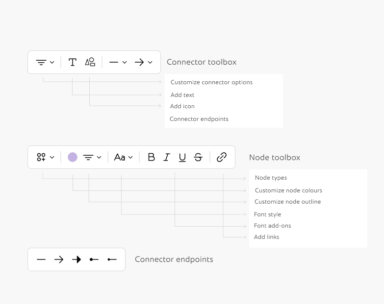
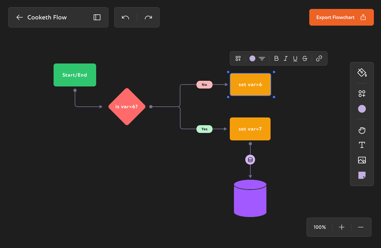
Inspector panels and Toolboxes
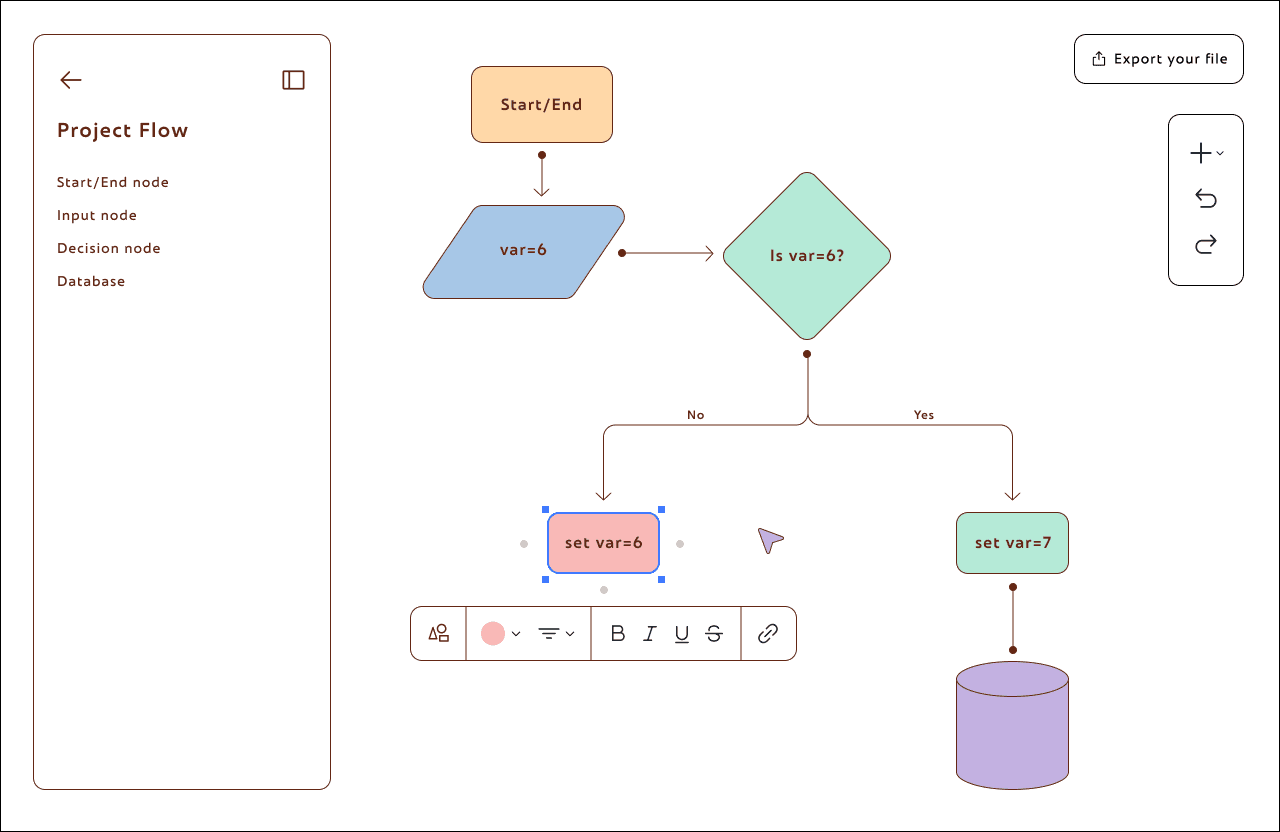
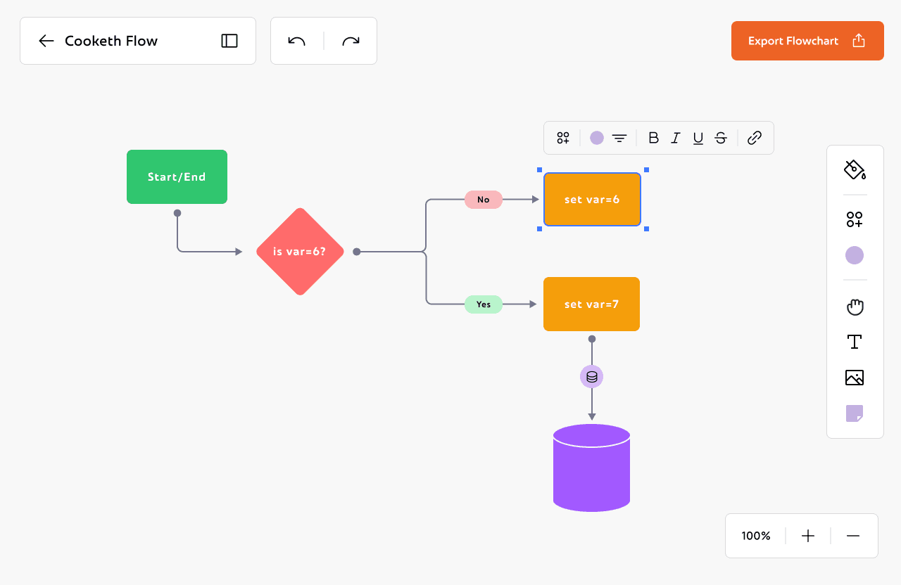
Here's a breakdown of some of the inspector panels and toolboxes used in the workspace.
Here's a breakdown of some of the inspector panels and toolboxes used in the workspace.
Now that I had both the palette and the base ready, I could move on to making all the Inspector Panels and toolboxes.
From here the rest of the process was smoothflowing and very easy to visualise. I didn't change the components much from the very first version of cooketh flow, so I didn't need to make detailed wireframes either. I could now focus on making the UX smoother and the UI better cartering to all the changes I made above.
Here's the detailed flow of the entire application:
This is the edit profile section. You can change you profile picture, name and username or change the theme according to your preference. There's also an option to delete your account permanently
CookethFlow is an open-source visual thinking tool, made for FOSS Hacks 2025. Built as an alternative to tools like Excalidraw, FigJam and draw.io, it helps in mapping your ideas and visualise them.
Desktop App
Whiteboard Tool
Project Details
• Figma
• FigJam
• UX/UI Designer
• UX Researcher
Duration
Ongoing
My Role
Tools
Project Overview
Flaws
Logo goes here
Reflections and Takeaways
Reflections and takeaways
Reflections and Takeaways
Reflections and Takeaways
Designing for Delight Without Losing Clarity
Designing for Delight Without Losing Clarity
Designing for Delight Without Losing Clarity
Letting Structure Carry the Weight
Letting Structure Carry the Weight
Letting Structure Carry the Weight
While working on Cooketh Flow, one of the things I kept coming back to was how to make the product feel fun without making it feel chaotic. I didn’t want it to look too serious or dry but also didn’t want the personality to get in the way of people just trying to get work done. Little choices like adding a warm-toned mascot, using colors that felt soft but confident, and writing microcopy that sounded like a real person helped me find that balance. It taught me that sometimes, design doesn’t need to scream delight; it just needs to feel like it’s on your side.
As the product grew, I realized how important it was to keep things consistent, not just visually, but in how everything worked. From onboarding to settings to the dashboard, I wanted each part of the experience to feel familiar without becoming boring. Repeating small design patterns, reusing layouts, and keeping interactions predictable helped make the app feel like one connected system. It also made it easier to add new things without overwhelming users.

The base inspo was MS Paint. so we opted for vibrant colours and elaborate ui while maintaining the rules of ux and accessibility.
The base inspo was MS Paint. so we opted for vibrant colours and elaborate ui while maintaining the rules of ux and accessibility.
The base inspo was MS Paint. so we opted for vibrant colours and elaborate ui while maintaining the rules of ux and accessibility.
The base inspo was MS Paint. so we opted for vibrant colours and elaborate ui while maintaining the rules of ux and accessibility.
The base inspo was MS Paint. so we opted for vibrant colours and elaborate ui while maintaining the rules of ux and accessibility.
The base inspo was MS Paint. so we opted for vibrant colours and elaborate ui while maintaining the rules of ux and accessibility.
Second Iteration (0.1.1)
The base inspo was MS Paint. so we opted for vibrant colours and elaborate ui while maintaining the rules of ux and accessibility.
The base inspo was MS Paint. so we opted for vibrant colours and elaborate ui while maintaining the rules of ux and accessibility.
The base inspo was MS Paint. so we opted for vibrant colours and elaborate ui while maintaining the rules of ux and accessibility.
The base inspo was MS Paint. so we opted for vibrant colours and elaborate ui while maintaining the rules of ux and accessibility.
The base inspo was MS Paint. so we opted for vibrant colours and elaborate ui while maintaining the rules of ux and accessibility.

Our new logo captures the playfulness we want to convey and also is a little spoiler for future features we are planning on adding.
Our new logo captures the playfulness we want to convey and also is a little spoiler for future features we are planning on adding.
Inspector panels and Toolboxes
Here's a breakdown of some of the inspector panels and toolboxes used in the workspace.
Designing for Delight Without Losing Clarity
While working on Cooketh Flow, one of the things I kept coming back to was how to make the product feel fun without making it feel chaotic. I didn’t want it to look too serious or dry but also didn’t want the personality to get in the way of people just trying to get work done. Little choices like adding a warm-toned mascot, using colors that felt soft but confident, and writing microcopy that sounded like a real person helped me find that balance. It taught me that sometimes, design doesn’t need to scream delight; it just needs to feel like it’s on your side.
As the product grew, I realized how important it was to keep things consistent, not just visually, but in how everything worked. From onboarding to settings to the dashboard, I wanted each part of the experience to feel familiar without becoming boring. Repeating small design patterns, reusing layouts, and keeping interactions predictable helped make the app feel like one connected system. It also made it easier to add new things without overwhelming users.
The name Cooketh came from a running joke between friends.
Whenever we found ourselves in a chaotic, slightly unhinged situation, we’d just sigh and say, "We are cooketh". It was our way of laughing through the mess.
So when it came time to chose a name for our project, there was no debate.
The branding didn’t stop at the name. We wanted something that captured the emotion of creating things in public, the pressure, the absurdity, the joy.
So we chose a tensed potato as our mascot.
Why? Because potatoes are my favorite vegetable. And also because sometimes, under pressure, we all feel like potatoes.
We named her Patootie.Her colors? #E97637 and #EB9943, wrapped in a bold black outline, flowing with the neu brutalism.
Flaws
Revisiting the branding